
Banking Experience Enhancements
Timeline: 10-week engagement
Project Objectives
Banking has become incredibly competitive and Wells Fargo wanted to revamp their WFAM user experience. To achieve this goal they asked us to create an attestation page that would filter their website’s content by role and location, design the functionality of a search engine, and a design system for their marketing campaigns.
My Role
As the lead visual designer on the team, I closely listened to the stakeholders, marketing director, and their lead of engineering to make sure the new designs aligned with their vision and tech capabilities. My primary focus was to apply visual design to wireframes, create a style guide of all assets with annotations for developers and create the prototypes. I also assisted the lead UX designer by wireframing key screens.
The Challenge
The main challenge of the project was to bring innovative and modern designs to an established organization with a strict set of constraints, regulations, compliance and technology limitations.

Attestation
The Approach
Wells Fargo wanted to integrate the 11 non-US audiences into the new WFAM website. This would include providing country-specific identification (attestations) and integrating the country-specific content. By building this “entrance” to their main website the users can access personalized content.
We did desktop research and created a mural board where we added first class examples of what competitors are doing when it comes to Attestation. We hosted a few working sessions with the client where they gave us their feedback on what would be feasible for their system and what was not going to work. From those working sessions, we created several UX explorations in lo-fidelity, visual design explorations and brainstormed together with the client to get to the final designs.
The Results
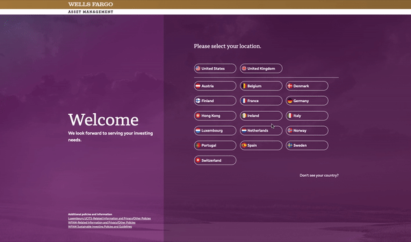
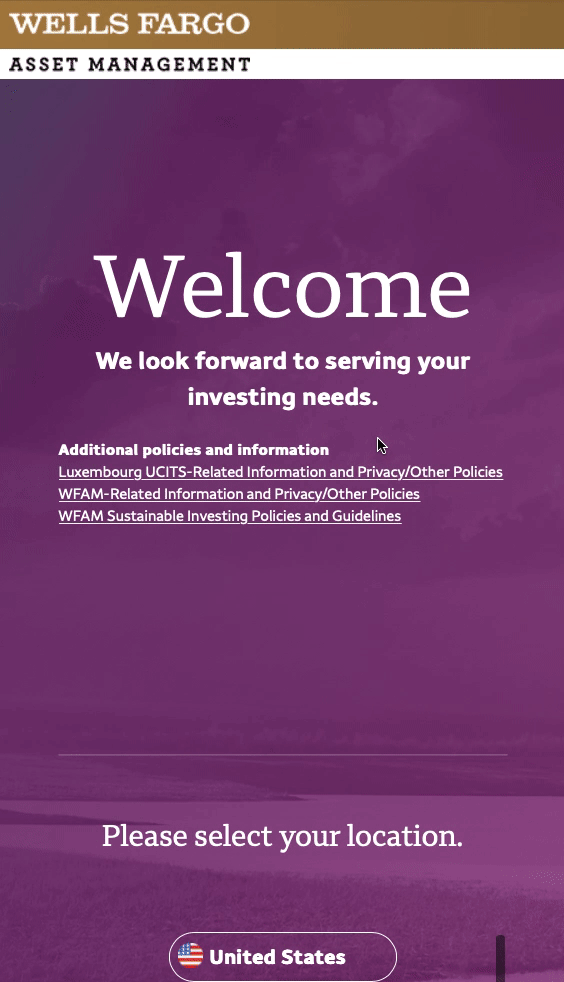
Welcome and Country Selection

A welcome message will live on the left side of the page, is static and does not change or move through the step process.
The right hand side panel with dark tint is static but the content inside slides in and out every time the users moves to the next step (see prototype for micro-animations).
The most common countries will appear at the top (United Kingdom and United States). We designed this to have three countries in one line and when they click on the country buttons they will take you to the next step.
Lastly, when user clicks on this link a window will expand full screen where the “don’t see your country” content will appear.

Select Role

This flow will have a “back” button that will be consistent on the top left of the panel to help user go back one step
There will be a bread crumb at the top right side of the panel displaying the selections from the user. It will be static and flag icon will change depending on the country the user had selected.
The roles options will be buttons and will have the same states as the website buttons. When the user clicks on the role this will take them to the next step in the process.
The final designs we created were simple but added an engaging way to enter the website without distracting away from the main task; entering the website. This was a new way to do an Attestation compared to their competitors.
Search
The Approach
We did the same approach with Attestations. We did desktop research and created another mural board where we did a competitive analysis of best in class examples of competitors and companies in other industries. From there the client guided us to what they felt was the right UX for their current tech capabilities.
The Result
We designed a robust search experience for the WFAM website. This would include the features and functions of the search box, a filtering system and search results.

Predictive search results with a few words

5 top categories for filtering
Sub filtering of tags (category, type, people)
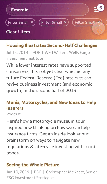
People Filter - Upon clicking a name, it will be pinned to the top of the list.
Campaigns
Approach
In order to understand how WFAM approaches campaigns, we conducted numerous stakeholder interviews across the organization. Additionally, we did an assessment of their current campaigns and based on that research we identified some larger design opportunities and key takeaways. This helped us understand what was currently working or not working with the current campaigns.
01. Improve page hierarchy by creating a flexible hero area with primary CTAs.
02. Design editorial content elements that enhance the story and improve the narrative structure of the page.
03. Elegantly integrate different content types, and create components that bridge the gap between campaigns and product content.
04. Create templates and components that accommodate the content, provide structure, are attractive and ultimately engage the end user.
Macro Template Breakdown
We created an approach very similar to using a website building tool full of divs and components that can be dragged and dropped. Below you can see the “shell” of the macro template and the range of component options. They can add or remove components depending on their content.

The Result
Defined by the breath of content two types of templates were created, a macro and micro campaign template. This gave the client a larger array of component variations to work with and provided a strong structure while allowing for flexibility regardless of the audience. We also created a design system with annotations and red lining so that the tech team at WFAM can use to develop the new designed search, attestation, and campaign templates.
Macro campaign template

Micro campaign template

Style guide example
